

Datepicker Tab Configuration
The Datepicker tab in Wescle AI Suite allows you to enable and customize the Air Datepicker functionality for forms and date selection fields. This tool provides flexible options, including inline calendars, time pickers, custom date ranges, and integration with Contact Form 7.
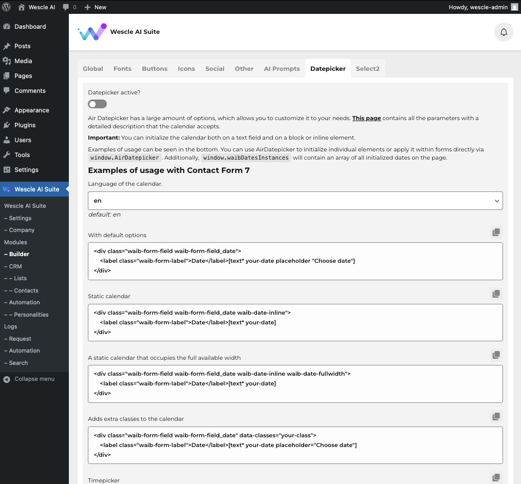
Enabling Datepicker
Datepicker Active? – Toggle this setting ON to activate the Datepicker functionality across your website.
Once enabled, Datepicker will be available for all compatible fields, including form inputs.
Customizing Datepicker Settings
Language of the Calendar
Select the default language for the calendar interface.
Example: “en” for English.
Default Datepicker Options
Use the provided HTML structure to add Datepicker functionality to form fields.
Available Datepicker Configurations
You can use the examples provided in the settings panel to integrate Datepicker into different components of your site.
With Default Options
<div class="waib-form-field waib-form-field_date">
    <label class="waib-form-label">Date</label>[text* your-date placeholder "Choose date"]
</div>
Static Calendar
<div class="waib-form-field waib-form-field_date waib-date-inline">
    <label class="waib-form-label">Date</label>[text* your-date]
</div>
A static calendar that occupies the full available width
<div class="waib-form-field waib-form-field_date waib-date-inline waib-date-fullwidth">
    <label class="waib-form-label">Date</label>[text* your-date]
</div>
Adds extra classes to the calendar
<div class="waib-form-field waib-form-field_date" data-classes="your-class">
    <label class="waib-form-label">Date</label>[text* your-date placeholder="Choose date"]
</div>
Timepicker
<div class="waib-form-field waib-form-field_date waib-date-timepicker">
    <label class="waib-form-label">Date</label>[text* your-date placeholder="Choose date"]
</div>
Adding buttons
<div class="waib-form-field waib-form-field_date waib-date-buttons">
    <label class="waib-form-label">Date</label>[text* your-date placeholder="Choose date"]
</div>
Range of dates
<div class="waib-form-field waib-form-field_date waib-date-range" data-range-separator=" - " data-disabled-dates="2024-11-13T00:00:00, 2024-11-21T00:00:00">
    <label class="waib-form-label">Date</label>[text* your-date placeholder="Choose date"]
</div>
isMobile
<div class="waib-form-field waib-form-field_date waib-date-ismobile">
    <label class="waib-form-label">Date</label>[text* your-date placeholder="Choose date"]
</div>
autoClose
<div class="waib-form-field waib-form-field_date waib-date-autoclose">
    <label class="waib-form-label">Date</label>[text* your-date placeholder="Choose date"]
</div>
Finalizing Your Settings
Customize the provided HTML structures to match your form requirements.
Use the correct classes and attributes to modify how the Datepicker behaves.
Click Save to apply your configurations.
By using these settings, you can enhance date selection on your site, making it more user-friendly and customizable for different form types.