
Labels Settings
The Labels section in the Universal Wescle Block allows you to add customizable labels for better organization, categorization, and highlighting of important content. Labels can be styled, positioned, and enhanced with icons to fit your website’s design and functionality.
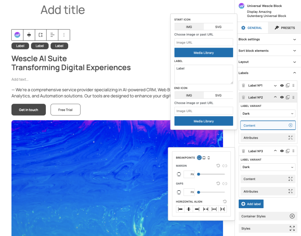
Adding & Managing Labels
Enter Text – Type the text that will appear in the label.
Label Variant – Select from different styles, such as:
Default – Standard label appearance.
Primary – Highlights important sections.
Dark – Uses a dark background for contrast.
Secondary – A lighter, alternative style.
Outline – Border-only design with no fill.
Link – Styled as a clickable label.
Danger – Used for warnings or alerts.
Success – Highlights positive messages or confirmations.
Adding Icons to Labels
Start Icon – You can add an icon before the label text.
Choose Image or SVG – Upload an icon or insert an SVG code.
Use Media Library – Select an image from the WordPress Media Library.
End Icon – You can also add an icon after the label text using the same method.
💡 Icons help labels stand out and provide better visual context for users.
Customizing Label Appearance
Container Styles – Adjust the padding, margin, and background of the label container.
Typography & Colors – Modify text color, font size, and style for better readability.
Styles & Attributes – Apply custom CSS classes or attributes for advanced styling.