Common Settings for Blocks
The Common Settings for Blocks section in Universal Wescle Block allows you to apply global settings to individual blocks, including turning blocks into sliders, adjusting layout types, defining spacing, and enabling advanced styling options. These settings provide flexibility in arranging and customizing content structures.
Turning Blocks into Sliders
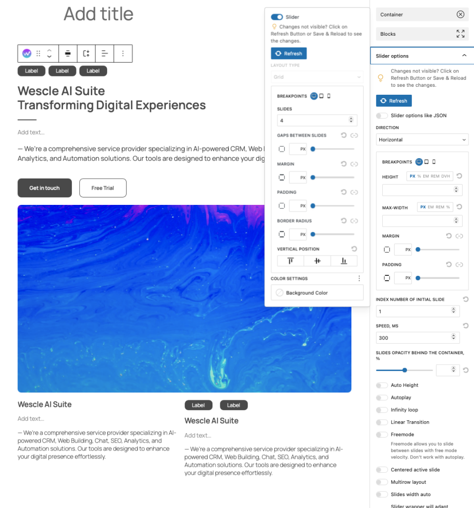
You can enable Slider Mode to transform blocks into a carousel-style layout.
How to Enable Slider Mode:
Toggle ON the Slider Option – This activates carousel functionality for selected blocks.
Adjust Slide Transitions – Set the transition speed and navigation behavior.
Configure Breakpoints – Ensure the slider adapts to desktop, tablet, and mobile views.
💡 Sliders are useful for displaying testimonials, portfolios, and image galleries in an engaging format.
Layout Customization
The Layout Type setting allows you to define how blocks are structured within a section.
Grid Layout
The Grid layout arranges content into evenly spaced rows and columns.
✔ Best for structured designs like pricing tables, portfolios, and multi-column sections.
✔ Ensures elements align properly within a fixed grid system.
✔ Works well with gap adjustments to define spacing between blocks.
💡 Use this layout when you need precise alignment and organization.
Flex Layout
The Flex layout is more adaptable and allows elements to dynamically adjust based on available space.
✔ Ideal for responsive layouts that adapt to different screen sizes.
✔ Supports Flex Grow & Flex Shrink to resize elements proportionally.
✔ Useful for sections with varying content sizes where auto-adjustment is needed.
💡 Best for flexible row-based layouts that need to adapt dynamically.
Masonry Layout
The Masonry layout automatically arranges blocks in a staggered or cascading grid.
✔ Best for image galleries, blog post grids, and uneven content blocks.
✔ Ensures items are positioned in the most efficient layout without uniform heights.
✔ Provides a modern, Pinterest-style look with no fixed row structure.
💡 Use Masonry when displaying items with different heights for a visually engaging layout.
Column Management & Spacing
Columns – Define how many columns a block should contain (e.g., 2, 3, 4 columns).
Gaps Between Columns – Adjust the space between columns for better readability.
Margin & Padding – Set the spacing inside and around the block for proper alignment.
Border Radius – Round the edges of blocks for a softer, modern look.
Vertical Position – Align block content to the top, center, or bottom.
💡 Proper spacing ensures blocks remain visually balanced and well-structured.
Box Shadow & Borders
Border Settings – Apply a solid, dashed, or dotted border to highlight blocks.
Box Shadow – Add depth with custom shadow effects:
Shadow Type – Choose between inner or outer shadows.
Offset X/Y – Adjust shadow placement.
Blur & Spread – Control shadow sharpness.
Shadow Color – Customize the shadow color for contrast.
💡 Adding shadows and borders enhances content visibility and depth.
Background & Color Customization
Background Color – Set a solid background color for individual blocks.
Image Background – Upload a background image for visually rich sections.
Overlay Options – Apply classic or gradient overlays to background images for enhanced readability.
💡 Using background customization helps sections stand out while maintaining readability.