
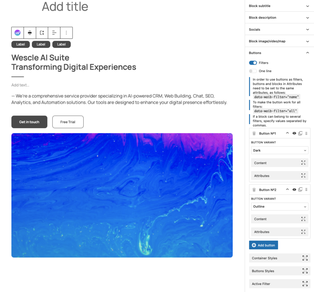
Buttons Settings
The Buttons section in the Universal Wescle Block allows you to create customizable buttons that can serve as either interactive call-to-actions (CTAs) or filters for blocks. You can style buttons, assign filter attributes, and configure their functionality based on your design needs.
Configuring Button Functionality
Buttons can function in two different ways:
Standard Buttons – Used as regular CTAs (e.g., “Learn More,” “Sign Up”).
Filter Buttons – Used to filter specific blocks on the page by applying data attributes.
Enabling Filters for Buttons
Toggle ON the “Filters” option to allow buttons to act as block filters.
To link a button to a block filter, add the attribute:
data-waib-filter=”name”
To make a button apply to all filters, use:
data-waib-filter=”all”
If a block belongs to multiple filters, separate values with commas.
💡 Filter buttons are useful for sorting portfolios, galleries, or categorized content dynamically.
Adding & Managing Buttons
Navigate to the Buttons Section
Open the Universal Wescle Block settings.
Expand the Buttons section.
Adding New Buttons
Click “Add Button” to create a new button instance.
Buttons are labeled as Button N°1, Button N°2, etc., for organization.
Reordering & Managing Buttons
Drag and drop buttons to rearrange them.
Click the eye icon (👁) to toggle visibility.
Duplicate or delete buttons as needed.
Styling Buttons
Each button can be styled individually using the following settings:
Button Variants – Choose from pre-designed styles:
- Default
- Primary
- Dark
- Secondary
- Outline
- Lin
- Danger
- Success
Color Settings – Customize the button’s:
- Text color
- Background color
- Border color
Typography & Sizing
Set font family, font weight, and size (S, M, L, XL).
Adjust line height and letter spacing for better readability.
Spacing & Alignment
Control padding, margin, and border radius.
Choose horizontal alignment (left, center, right).
Adding Icons to Buttons
Each button supports icons before or after the text:
Start Icon – Add an icon before the button text.
End Icon – Add an icon after the text.
Icon Type – Choose between image upload or SVG code.
Use Media Library – Upload an icon directly from WordPress.
💡 Icons enhance button clarity and improve UI/UX appeal.
Advanced Customization
Container Styles – Modify button placement within its section.
Button Styles – Customize additional visual settings.Active Filter – Manage filter states for buttons assigned to block filtering.