Blocks Settings
The Blocks section in the Universal Wescle Block allows you to create highly flexible layouts by nesting blocks inside other blocks. Each block contains all the previous customization settings, giving you the freedom to structure, style, and modify any part of your website dynamically.
This section provides endless customization possibilities, allowing you to repeat structures, apply unique styles, and fine-tune content for different use cases.
Creating & Managing Blocks
Navigate to the Blocks Section
Open the Universal Wescle Block settings.
Expand the Blocks section.
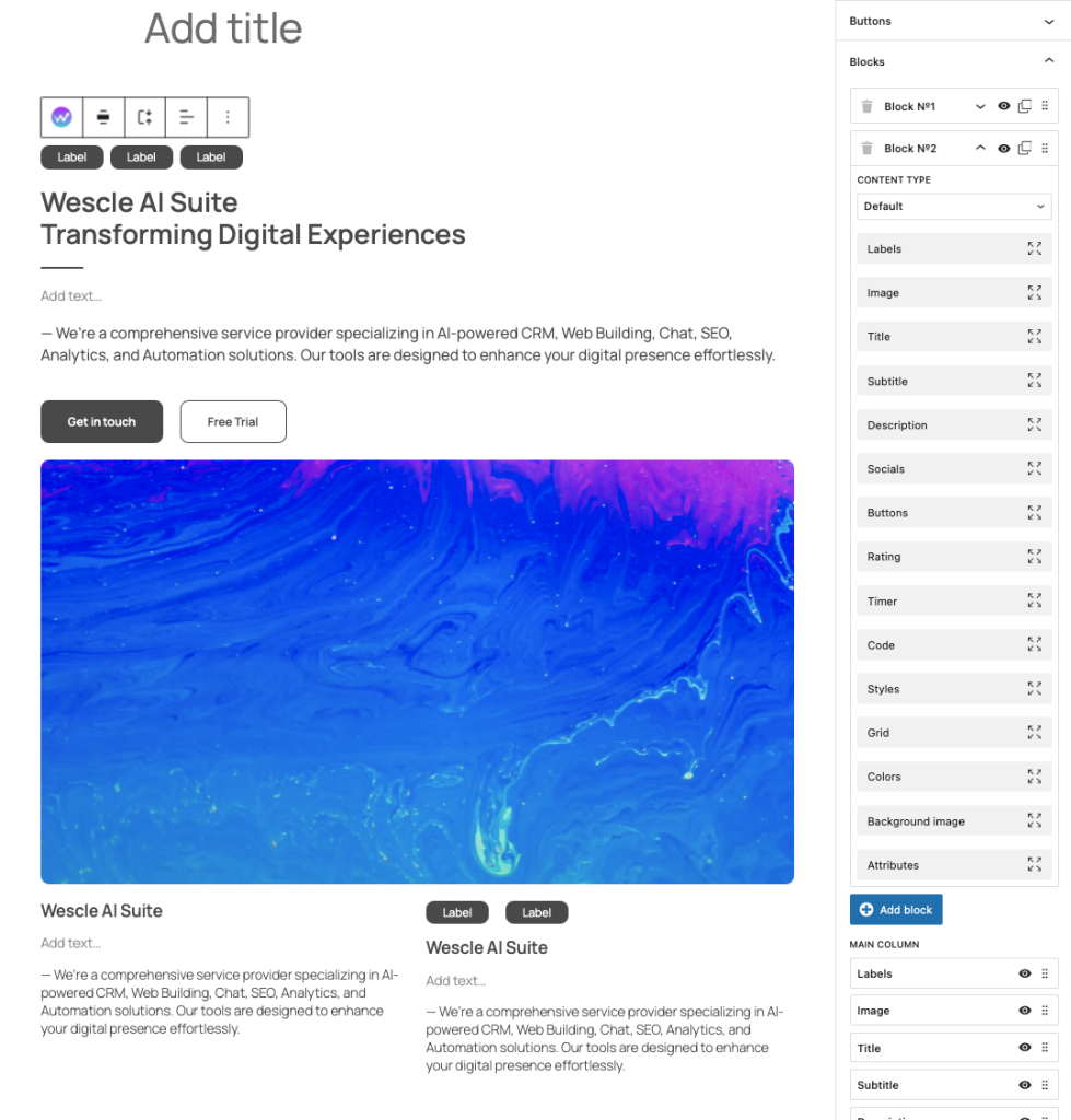
Add New Blocks
Click “Add Block” to insert a new block.
Each block is labeled as Block N°1, Block N°2, etc. for easy organization.
Customize Individual Blocks
Each block can contain multiple elements, including:
✔ Labels
✔ Images
✔ Titles & Subtitles
✔ Descriptions & Socials
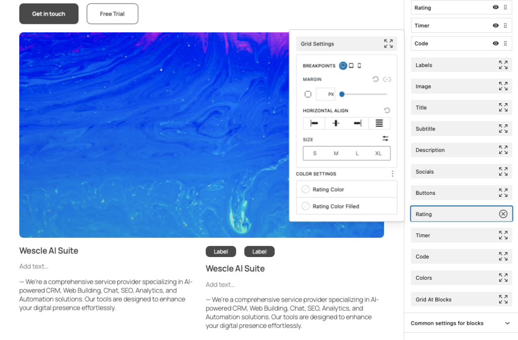
✔ Buttons & Rating Systems
✔ Timers, Code Snippets, and Background Images
💡 Each block functions as an independent container that can be styled separately while inheriting settings from parent blocks.
Nesting Blocks Within Blocks
One of the most powerful features is the ability to create blocks inside blocks for highly structured layouts.
Main Column Blocks – The primary structure for placing content.
Nested Blocks – Additional layers inside blocks to group and organize content.
Grid & Layout Blocks – Use grids for advanced positioning within blocks.
💡 By nesting blocks, you can build complex page layouts while keeping elements modular and reusable.
Block Customization Options
Every block has all previous settings available, including:
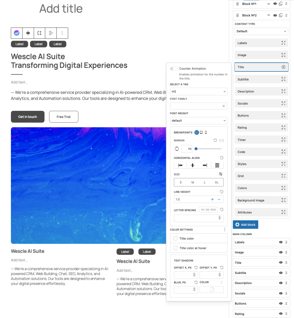
Typography & Styling
Font Family, Size, Line Height, and Letter Spacing
Text Alignment (Left, Center, Right, Justified)
Text Colors, Background Colors, and Borders
Custom CSS Classes for Advanced Styling
Layout & Spacing
Margin & Padding Adjustments
Border Radius for Rounded Edges
Breakpoints for Mobile, Tablet, and Desktop Customization
Interactive Elements
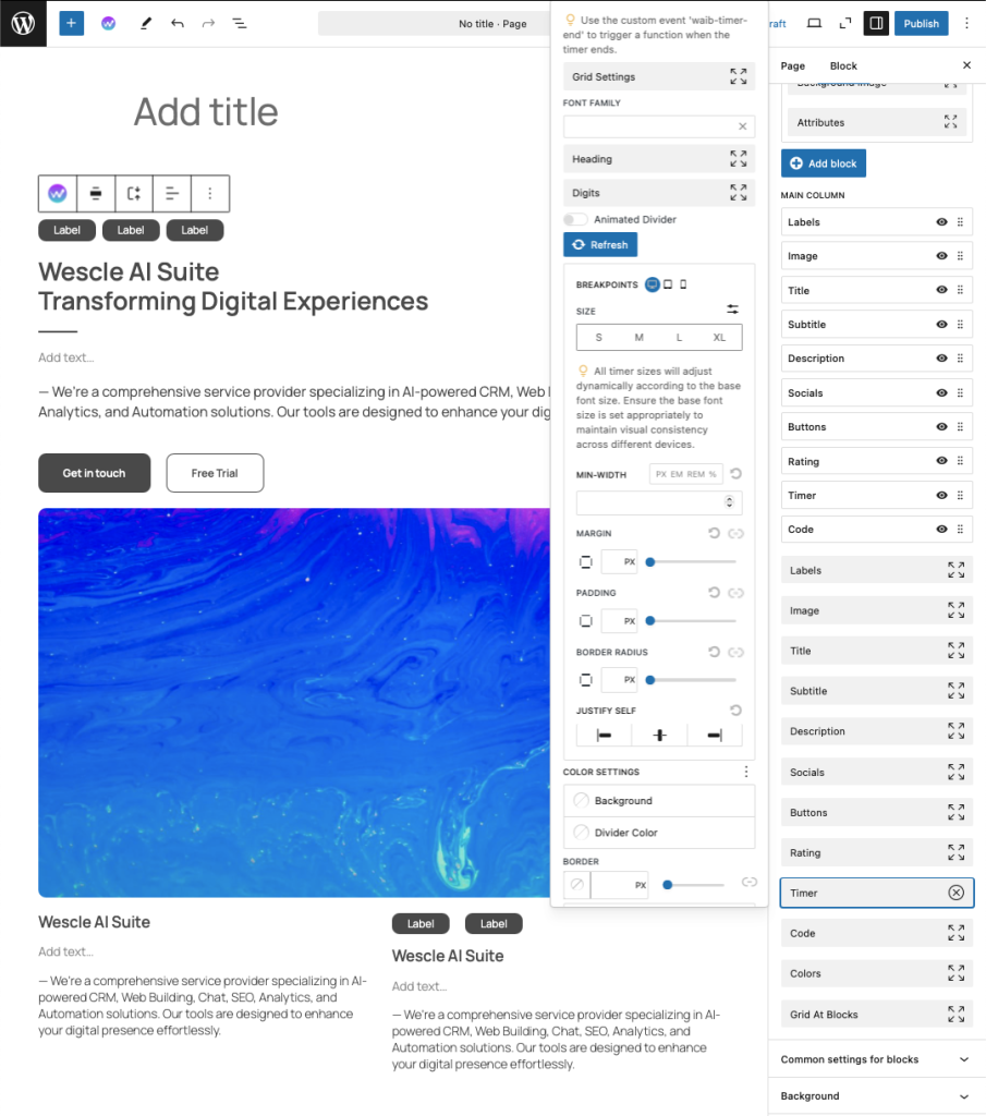
Timers – Set countdowns by hours or specific dates.
Rating Systems – Display star-based ratings or custom rating values.
Code Blocks – Insert custom HTML, CSS, or JavaScript within blocks.
💡 These features allow you to create dynamic and interactive sections for different use cases like promotions, testimonials, or custom widgets.
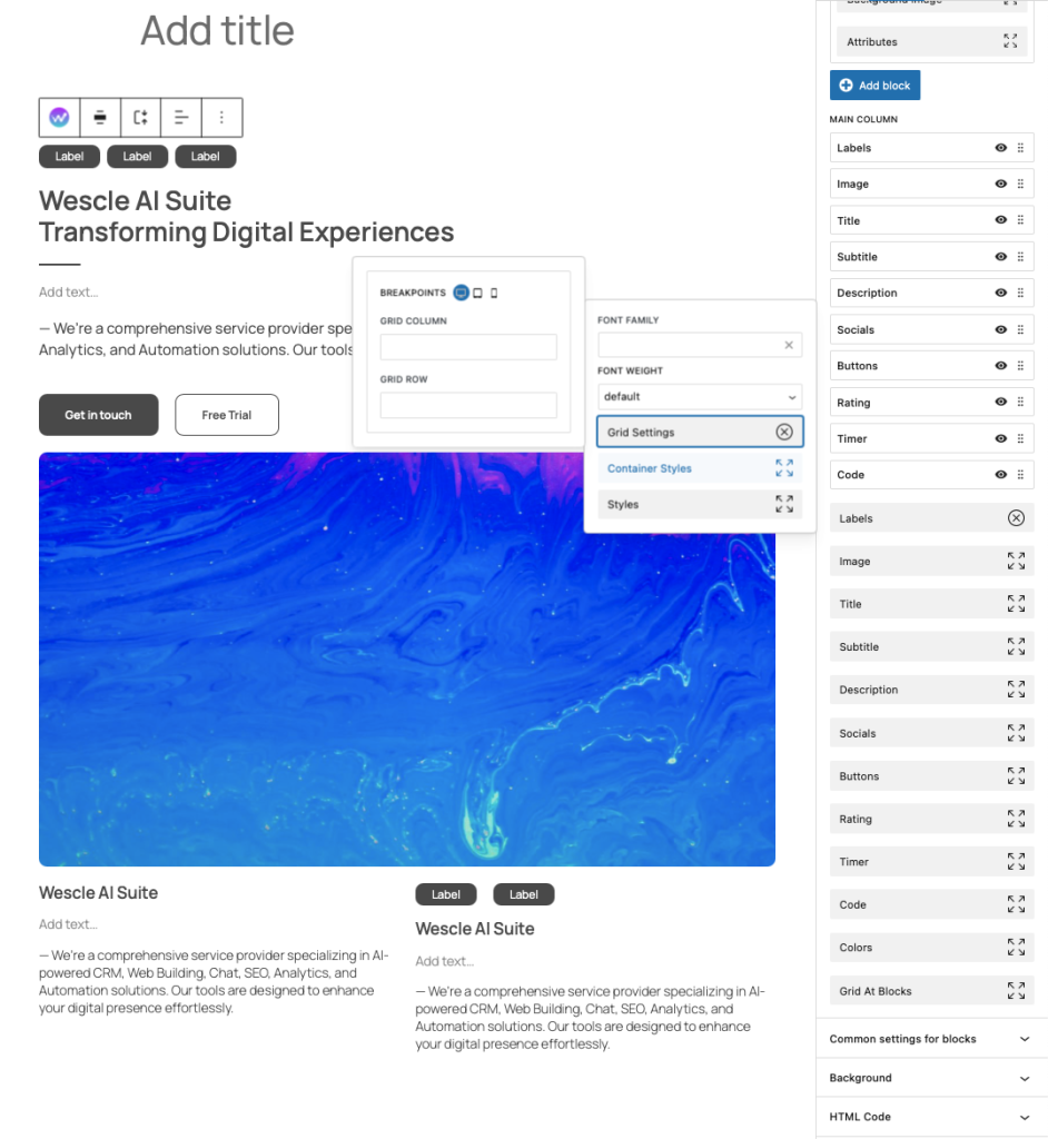
Grid & Alignment Controls
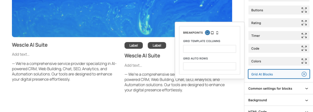
Grid Layout – Define grid-row and grid-column structures.
Align Self & Align Content – Control alignment for individual elements.
Justify & Distribute Settings – Adjust how content is positioned within blocks.
💡 Grids allow for precise structuring, making it easy to create complex layouts with equal spacing.
Advanced Features
Attributes – Add custom data attributes for developer-level customization.
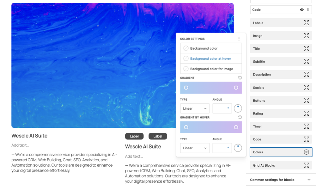
Background Image & Color Controls – Apply unique backgrounds per block.Custom Animations & Interactions – Configure hover effects and entrance animations.